Robert Venturi’s passing yesterday at age 93 bookends the life of an extraordinarily influential architect and scholar. Working in tandem with his partner and wife Denise Scott Brown, he helped not only create many of the uber-texts of postmodern architecture theory, but also designed masterpieces now seen as cornerstones of the movement.
The Philadelphia-based, Pritzker Prize-winning architect became famous for his mid-’60s “gentle manifesto,” an idea that, in part, chided modernist architecture for being too staid and set in its ways. An examination of his career highlight shows how he lived up to his ideals of a more eclectic, playful, and personable style of architecture, one that had vision while respecting vernacular design.
Here are some of the important works that helped define Venturi’s career.
Guild House: Callowhill, Pennsylvania (1964)
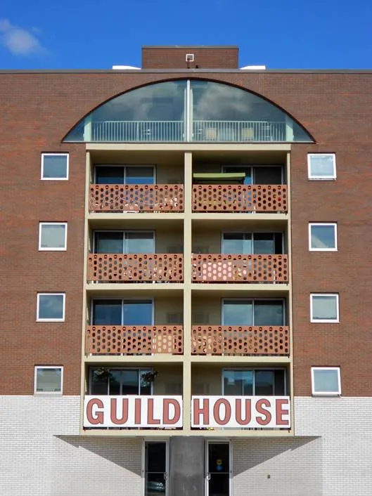
The first major work by Venturi, this senior housing complex was also an early example of postmodern architecture. Topped with a Palladian window, the 91-unit brick structure incorporated humble, everyday elements and flourishes, such as brick walls and a block-letter sign. Don’t say architecture can’t be funny; the structure was originally topped with a gilded antenna, both a reference to the religious spires that dot the Philadelphia skyline and a sly wink at the most popular pastime of retirees, watching television.
Vanna Venturi House: Chestnut Hill, Pennsylvania (1964)
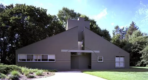
Originally designed for Venturi’s mother, this home, filled with contradictions including a functionless arch, was one of the first postmodern designs, and one of the rare residential projects to win the 25-Year Award from the American Institute of Architects. Curbed architecture critic Alexandra Lange, who visited the home in 2016 after it had been added to the Philadelphia Register of Historic Places, wrote that it “is itself a gentle manifesto, the gable a blow against the aesthetic tyranny of the modernist flat roof; the square windows a blow against the aesthetic tyranny of transparent walls.” Supposedly, Venturi used to visit the house on a weekly basis, stopping to admire it, then blow it a kiss as he drove away.
Fire Station #4: Columbus, Indiana (1968)
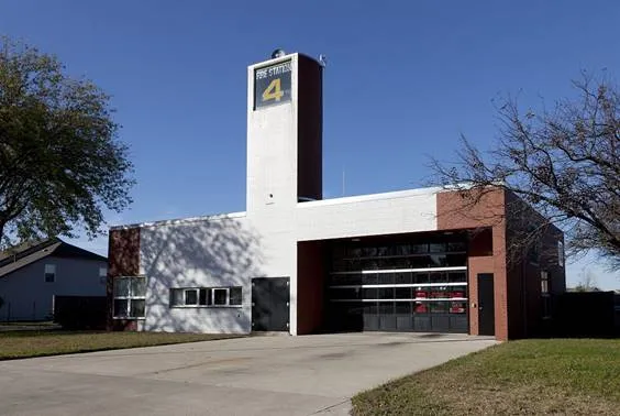
One of the standouts in Indiana’s mecca of modernist architecture, this clean, simple brick building was meant to be a functional and inexpensive space. Unlike many of his architectural peers, Venturi delivered a design that actually met those criteria. Between the simple material—cinderblock, red and white unglazed brick, and glass—and straightforward layout, with the only protrusion being a tower used to dry hoses, this fire house was an understated example of civic design. The tower and contrasting color of the bricks exemplified Venturi’s “billboard architecture” concept, offering a flash of excitement on an otherwise bland roadway.
Unbuilt College Football Hall of Fame: New Brunswick, New Jersey (1967)
While this speculative design was never completed, its influence looms large over the museum and art worlds. Venturi and Brown devised a museum that honored football in its most natural environment, that is to say, on the screen. The unbuilt paean to the college game featured a towering, flat facade, upon which video would be broadcast at a scale big enough to turn the parking lot into drive-in, according to critic Witold Rybczynski. Along with the grandstand at the rear of the building, the museum concept and its ahead-of-its time use of video and multimedia shows the duo thinking about architecture as a platform for emerging digital technologies.
Franklin Court: Philadelphia, Pennsylvania (1978)
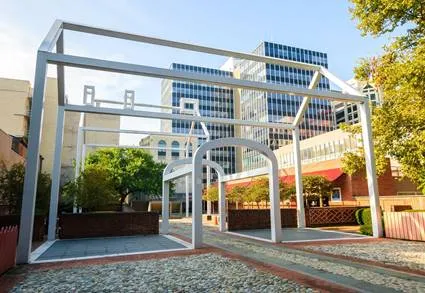
Another subtle but significant design by a master of symbolism, this addition to Independence National Historic Park has become a Philadelphia favorite. Atop the site where Benjamin Franklin once ran his printing shop, Venturi, Brown, and then collaborator and colleague John Rauch set two “ghost houses,” representing the Franklin residence and office. The white tubular steel outlines, award-winning examples of playful placemaking that allow visitors to reconstruct the buildings in their imaginations, have become icons and object lessons for
Nothing is more pedestrian than a big box store. Venturi and Brown managed to design one for BEST, a chain known for its abstract and sculptural stores, that was bold while staying within its core crass and commercialist confines. By outfitting the building in a facade of porcelain steel panels, in a red-and-white flower pattern that could be a mid-America Marimekko, the “wallpaper” drew in shoppers and created a strip mall standout.
Gordon Wu Hall: Princeton, New Jersey (1982)
Described as “witty, relaxed, wise and comfortable” by architecture critic Paul Goldberger, this small residence hall on the Princeton campus reflects the architects’s respect for history and the Gothic style predominant on campus. The playful heraldic symbols above the doorway, and the mixtures of styles and elements found in the orange brick building, what Goldberger calls “compositionalism,” shows Venturi finding a perfect, if eccentric, solution to the confines of a small site.

Comments are closed.